
Shapes
Diagonal
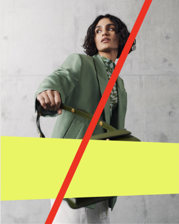
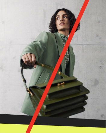
The diagonal usage in our new home feed, gives a unique fresh and yet professional look. It has become part of our core and should be incorporated in our visual language across channels.

To guarantee uniformity of the angle and thus define a more uniform overall appearance, the angle should always be 2.3 degrees and the diagonal should run from top left to bottom right.The shape can be scaled as a whole, but should always be checked for uniformity.
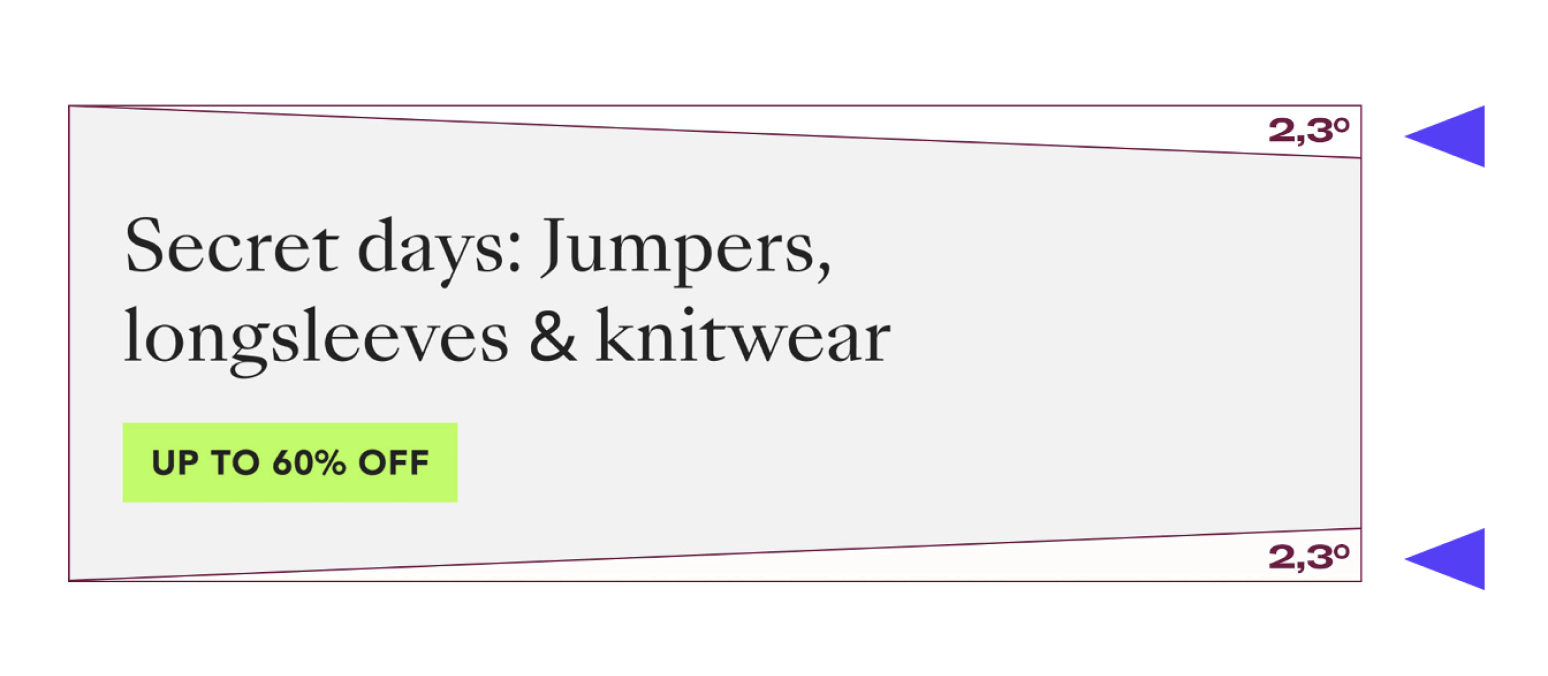
In order to define the overall image of the brand and to standardise the use of the shape, we recommend that the shape be used as a percentage as follows.
Horizontal
No more than 25 % of the total asset
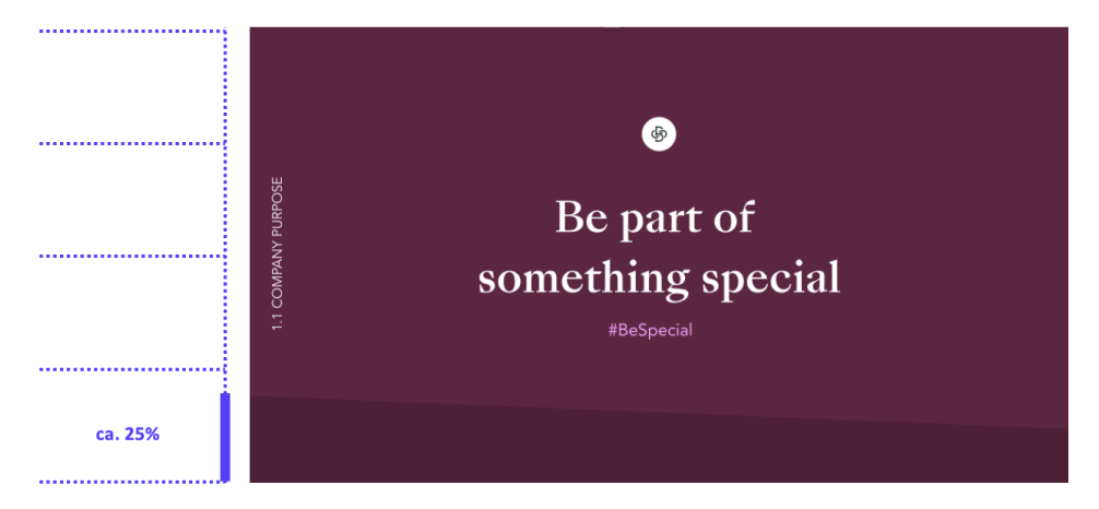
Vertical
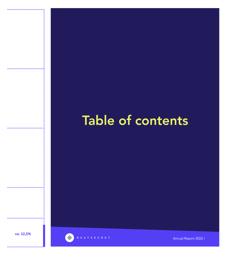
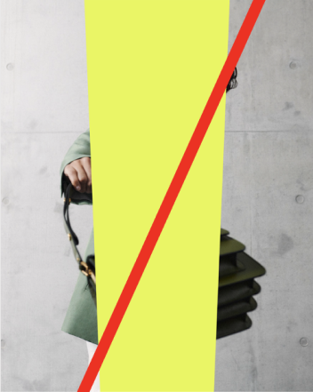
No more than 12,5 % of the total asset
In order to define the overall image of the brand and to standardize the use of the shape, we recommend that the shape has a minimum size. The shape is a decorative element and should be used as such. It provides space for text or adds color. It should be seen, but not play the main role.
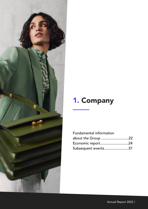
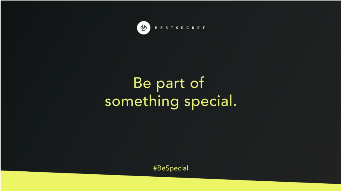
DO'S
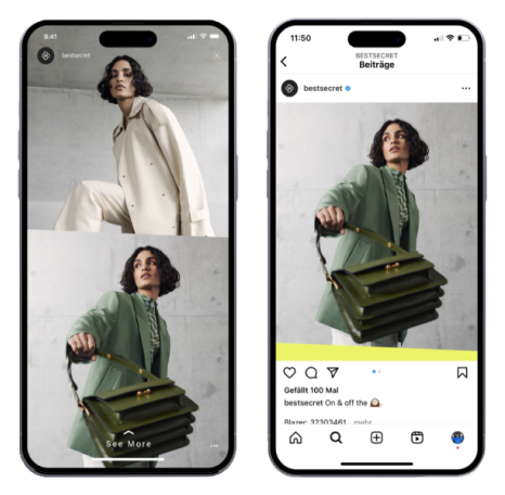



Dont's
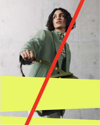
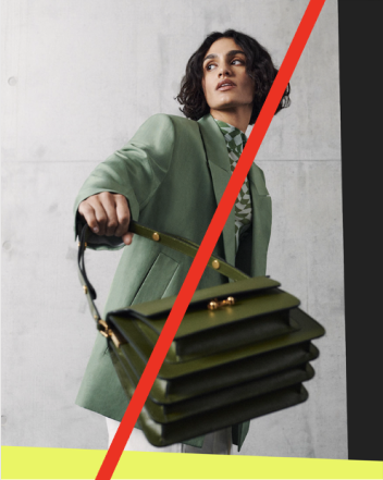
Stripes
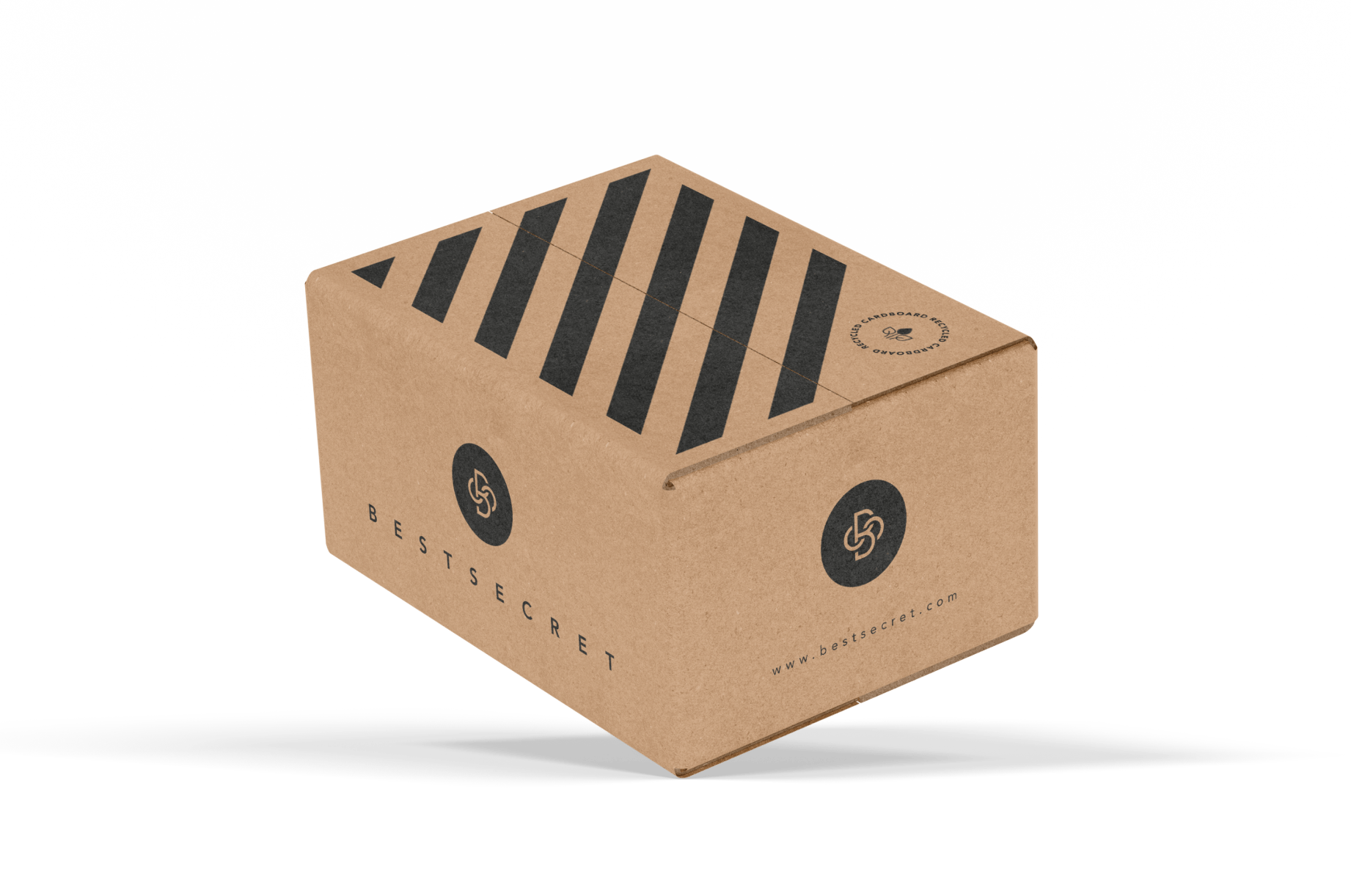
These slanted lines, with their perfect balance of subtlety and impact, create a sense of movement and energy. The colour combinations enhance them visually, appealing to exclusivity, strength, and simplicity. By incorporating these diagonals into our brand's packaging, as well as other corporate and B2B communications, we establish a strong visual identity that commands attention and conveys elevated value, ensuring a premium look and feel that sets our brand apart.



Color combination and structure
To enhance recognition and avoid overwhelming the customer's eye, we streamline the color combinations and structure to a select few. Our aim is to project a premium and bold image, exuding modern luxury. These combinations will be exclusively utilized for corporate and B2B communications.
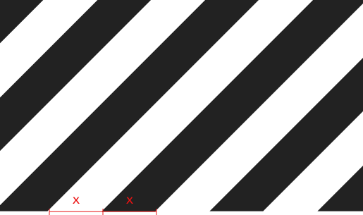

Do not change the gap between the stripes, the gap should measure the same size as the stripe.To create an even and balanced pattern, the stripes should not be cut off awkwardly or mirrored in irregularly if possible.Do not use the stripes in other colours than #222222 and Black 100% (as stated in the previous page)
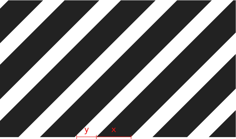
DO'S
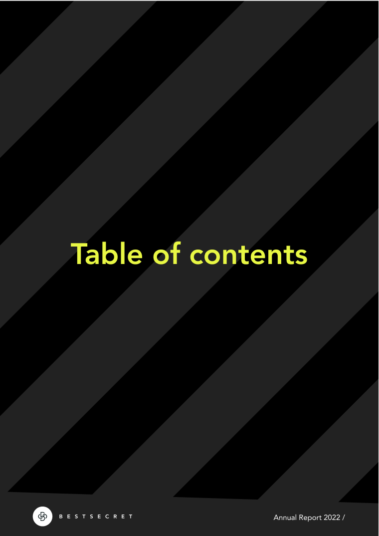
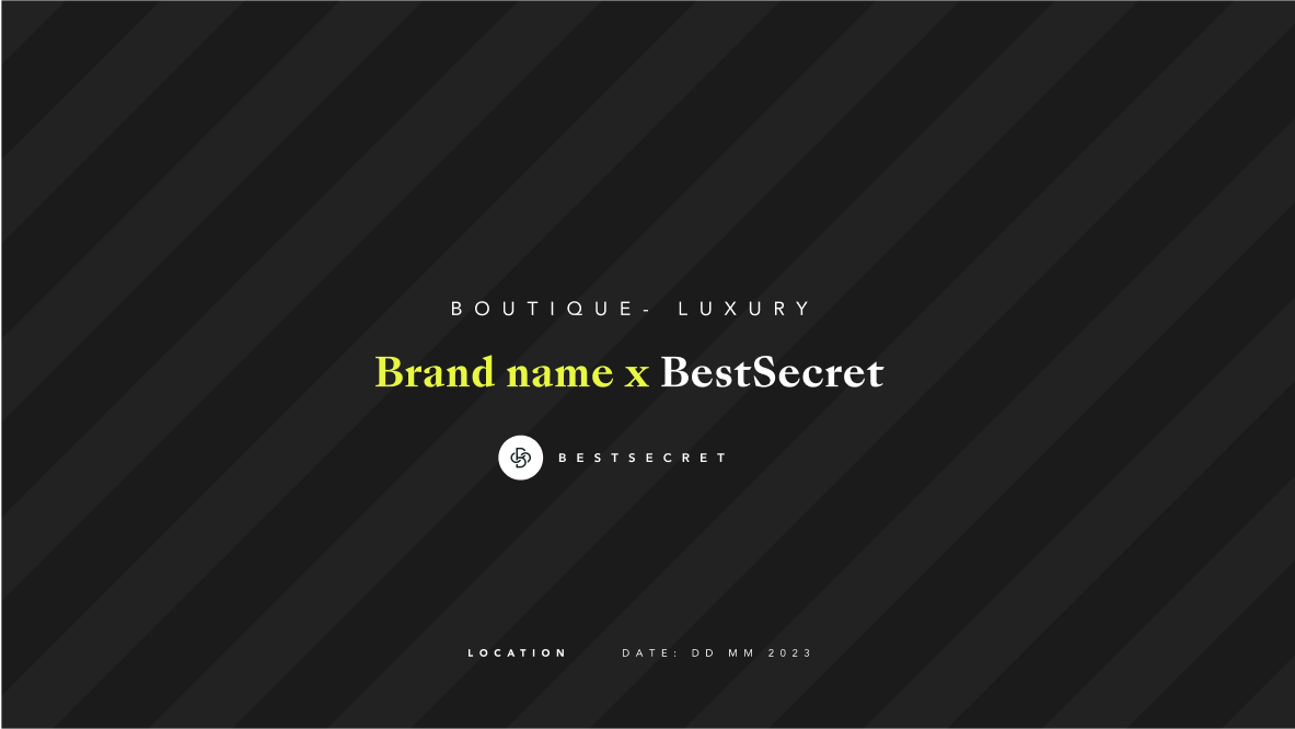
The stripes BG (Perfect Black and Black) could be conbined with our typos (Sans Bleu and Avenir).We could use highlight colour only for the typos or to spotlight some other details on our communication


DONT'S
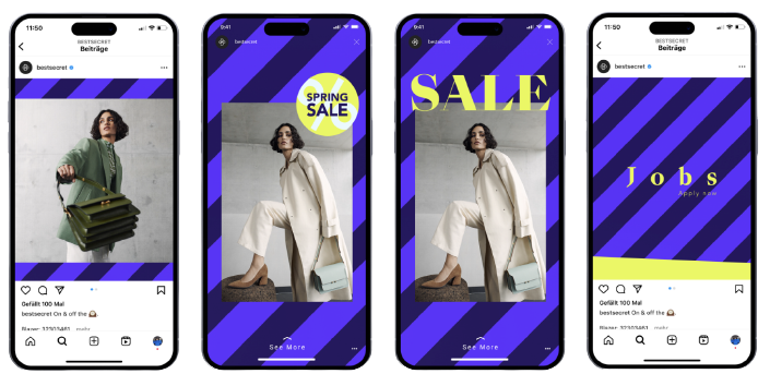
The stripes should be limited to corporate communications for internal use, such as employer branding or B2B. It's important to ensure that the graphics are not overly busy. Avoid combining the stripes with diagonals or any other prominent elements. The combination of shapes should be subtle, always with a premium and elevated intention. Strictly adhere to the previously stated color combinations.
Circle
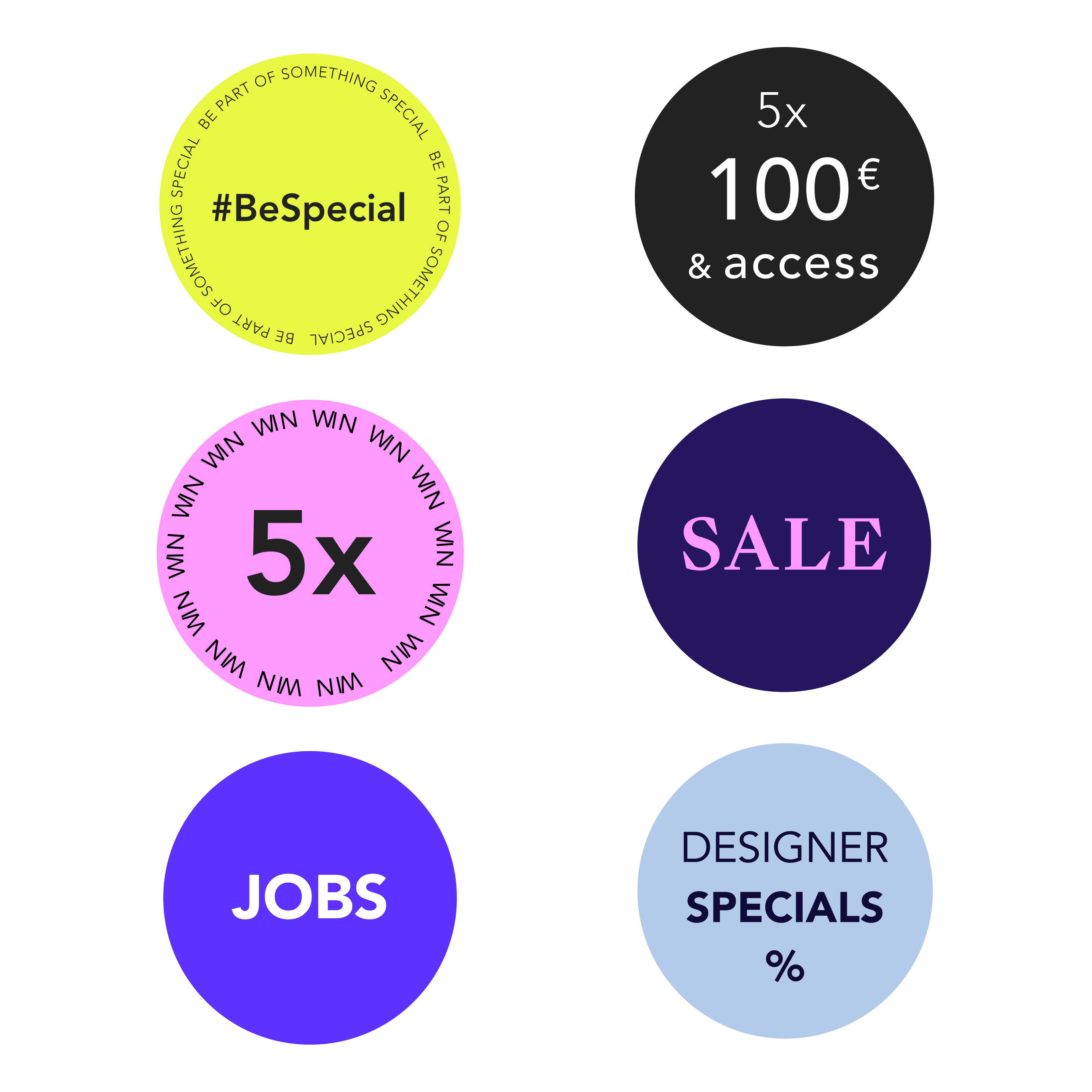
Derived from the iconic element in our logo; we incorporate this shape selectively, ensuring it adds value and aids in organizing relevant information visually. Circles symbolize unity, harmony, and inclusivity, aligning with our brand's values. By thoughtfully integrating circles, we reinforce our brand identity, communicate with clarity, and create a cohesive and meaningful brand experience.
DO'S
Here are examples of where and how to incorporate the circle:
- Utilize the shape when it adds value or optimally organizes and displays relevant information.
- Simplify the typography to maintain a clean and straightforward look. When combining text and/or icons, ensure a good contrast between the elements.
- Different color combinations are permissible as long as they have a clear intention and correlation with the color palettes and communication.
Dont's
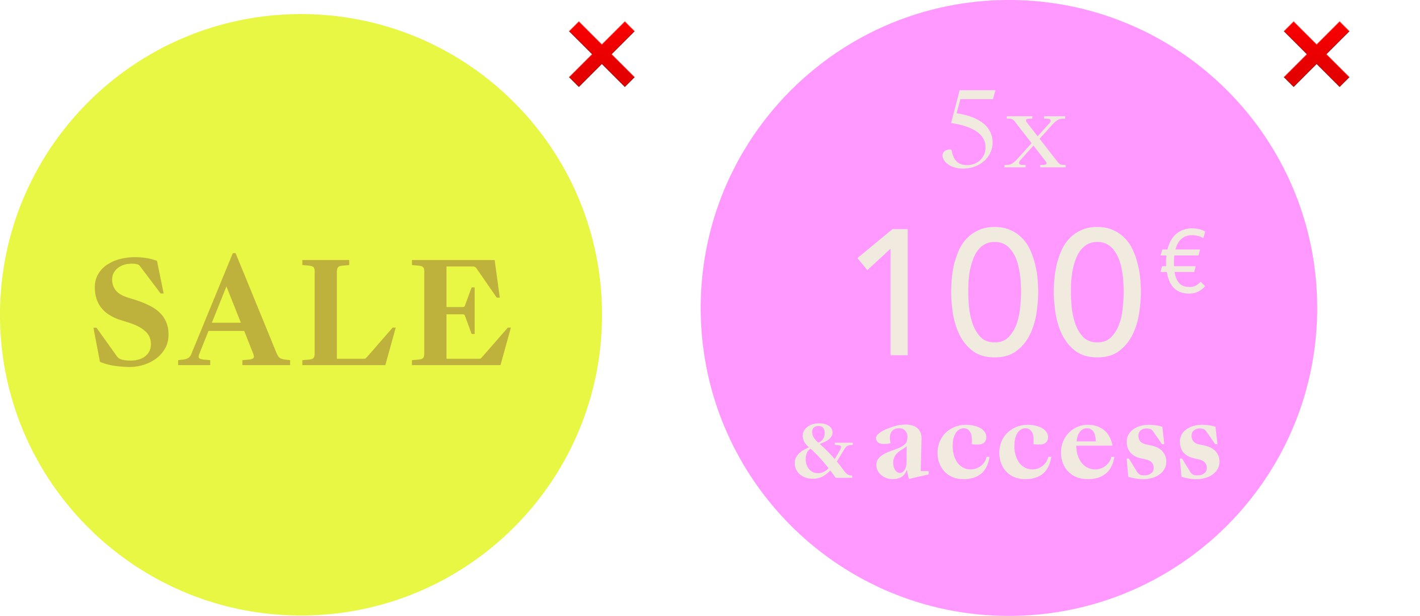
Here are examples of how NOT to incorporate the circle:
- Not enough colour contrast.
- Too many font variants.
- Not correlated with our colour palettes and type of communication.
Dashline
The dash line is part of our UI and can be used for ornamental purposes within the defined specifications, mainly in our corporate assets.
Generally should be used in horizontal. Only for codes, it will be implemented in vertical.

Icons

Lines
Outline icons Lines centeredStroke terminal: Rounded
Forms
Flat and simple, reduce complexity, no 3D (tbd), use simple shapes

Edges
Rounded corners min. 1px
Examples


