
SOME
Blockbuster Story Cover
Blockbuster story cover should be aligned with CRM main visual with its main picture, title, discount and theme colour.
The layout of cover slide can vary in 3 ways:
- Title on top layout Classic layout with comprehensive visual hierarchy.
- Discount focus layout
The main focus is on the discount. Campaign name is placed in the bottom rectangle in medium size to not compete with the discount text. - Centred layout
All important information including campaign name and discount should be in the same centred wireframe.

medium size title +bigger size discount
Large size discount +small size title in the lower rectangle
All information in thecentred wireframe
Sale Story Cover
SALE story cover should be aligned with CRM main visual with its main picture, title, discount and theme colour.
The layout of cover slide can vary in 3 ways:
- SALE focus layout
The layout emphasis SALE text on the bottom to have main focus on the text. - Discount focus layout
The main focus is on the discount. SALE text should be in small size to not compete with the main text. - Balanced layout
All important information should be in the same centred wireframe. Bottom coloured diagonal should be placed with specified size.

medium size discount +
SALE in prominent size

prominent size discount +
small size SALE x 3 times

SALE and discount in balanced size
with dash + diagonal
Sale Story Product Slide
Product should be visible and stand out with clean and solid background aligned with CRM visual. Background colour can be darker in case od light coloured product.
Diagonal shape can be used in the way that it highlights clickable part of the slide, such as CTA or poll.
The layout can vary depending on the number od product shown, type of story, poll:
- Vertical layout
This layout is applicable while the slide has few number of product. - Dark background
Dark background colour highlights light coloured products in order to make them stand out. - Light background
Basic background colour which is applicable for any type of product slide, except with light coloured product.
Note: Layout can be slightly adapted depending on the products
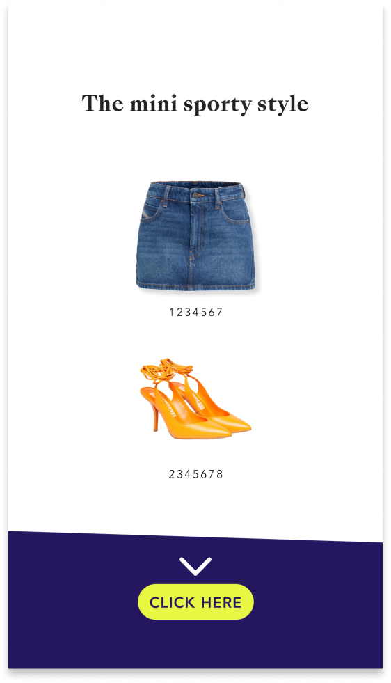
medium size discount +
SALE in prominent size
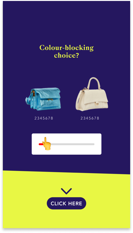
prominent size discount +
small size SALE x 3 times
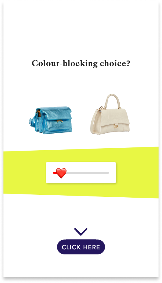
SALE and discount in balanced size
with dash + diagonal
Outro Slide
Outro slide is an informative slide of the campaigns. This slide works as a reminder of important information communicated on the cover slide. The layout should be aligned with cover slide.
For SALE and NEW IN stories, the text should be readable on the solid background colour. For daily story,
The layout should be aligned with cover slide:
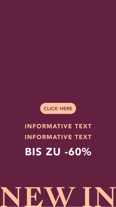
- SALE and NEW IN outro
Using solid background colour, main text in the same way as the cover slide. - Daily story outro
Main picture can be used in different size and position, placing solid dark overlay with transparency to make CTA text readable.



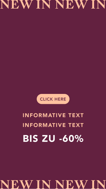

NEW IN Story Cover
The 3 layouts are based on SALE layouts. Main colour should be aligned with CRM main visual. Coloured gradient can be applied in order to make text visible.
The layout of cover slide can vary in 3 ways:
- NEW IN focus layout
The layout emphasis NEW IN text on the bottom to have main focus on the text. - Discount focus layout
The main focus is on the discount. NEW IN text should be in small size to not compete with the main text. - Balanced layout
All important information should be in the same centred wireframe. Bottom coloured diagonal should be placed with specified size.

medium size discount +
SALE in prominent size

prominent size discount +
small size SALE x 3 times

SALE and discount in balanced size
with dash + diagonal
Daily Story Cover
Daily story cover should look simple and clean with inspirational picture and prominent title. Black gradient can be applied in case of lighter background image in order to make text visible.
Text position is changeable depending on the main subject of the inspirational picture.
Bottom diagonal colour can vary, applying CI colours according to the topic of the story.
2 sizes of bottom diagonal can be applied for the cover slide:
- Normal diagonal
This layout is the basic layout for the daily story. Bottom diagonal is used as BestSecret’s symbol in CI colour, should be used in specified size and height. - Informative diagonal
Bottom diagonal can be used in greater size in case of informative or bottom bottom text. Picture overlay gradient should not be applied over the diagonal. - Depending on the main picture and text length, bottom diagonal can be removed in order to keep the overall look and feel clean and balanced.

Prominent title +
thinner diagonal under CTA

Prominent title +
thinner diagonal under CTA
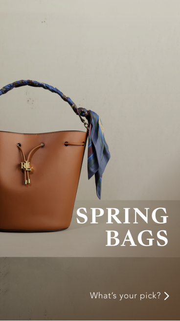
Example 1

Prominent title +
diagonal as bottom text background

Prominent title +
diagonal as bottom text background

Example 2
Daily Story Product Cover
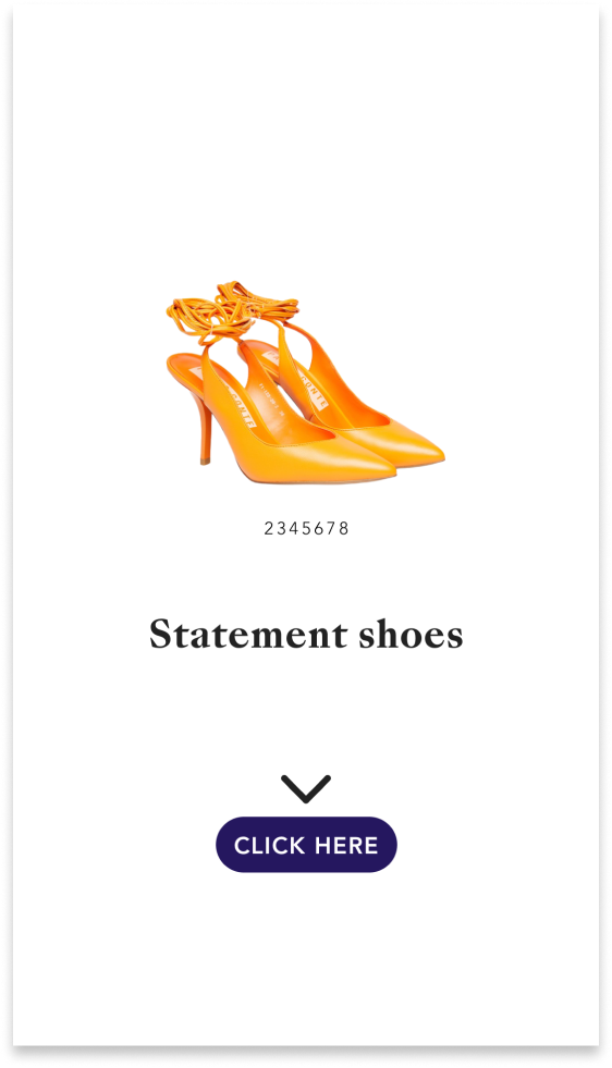
- Single product
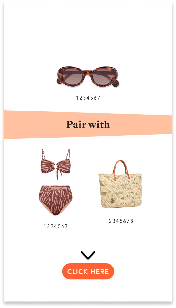
For the product which stands alone can be used without any background shape or colour. Make sure to have the text size enough prominent. - Pair with style
Diagonal shape can be used as highlight and separator of main product and secondary products. - Picture & products
Inspirational picture should be used in vertical diagonal shape next to the featured products. Picture part should be less than 50% of the total area.
Note: Layout can be slightly adapted depending on the products
medium size discount +
SALE in prominent size
prominent size discount +s
mall size SALE x 3 times

SALE and discount in balanced sizewith dash + diagonal
Grid
The grid is a place to express our tone of voice in an inspirational way, mixing the companies visual materials with other inspirational content aiming for our brand values.
Visual approach:
Mixing different types of content to give a diverse overall look & feel. I.e. selected BS shooting material, influencer and brand collaborations, creative product shots, follower content.
Emotional connection:
Each post taps into the emotions of our viewers. We are storytelling with the use of locations, products, quotes, holidays and individuals.