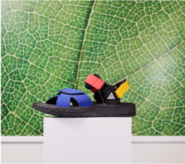
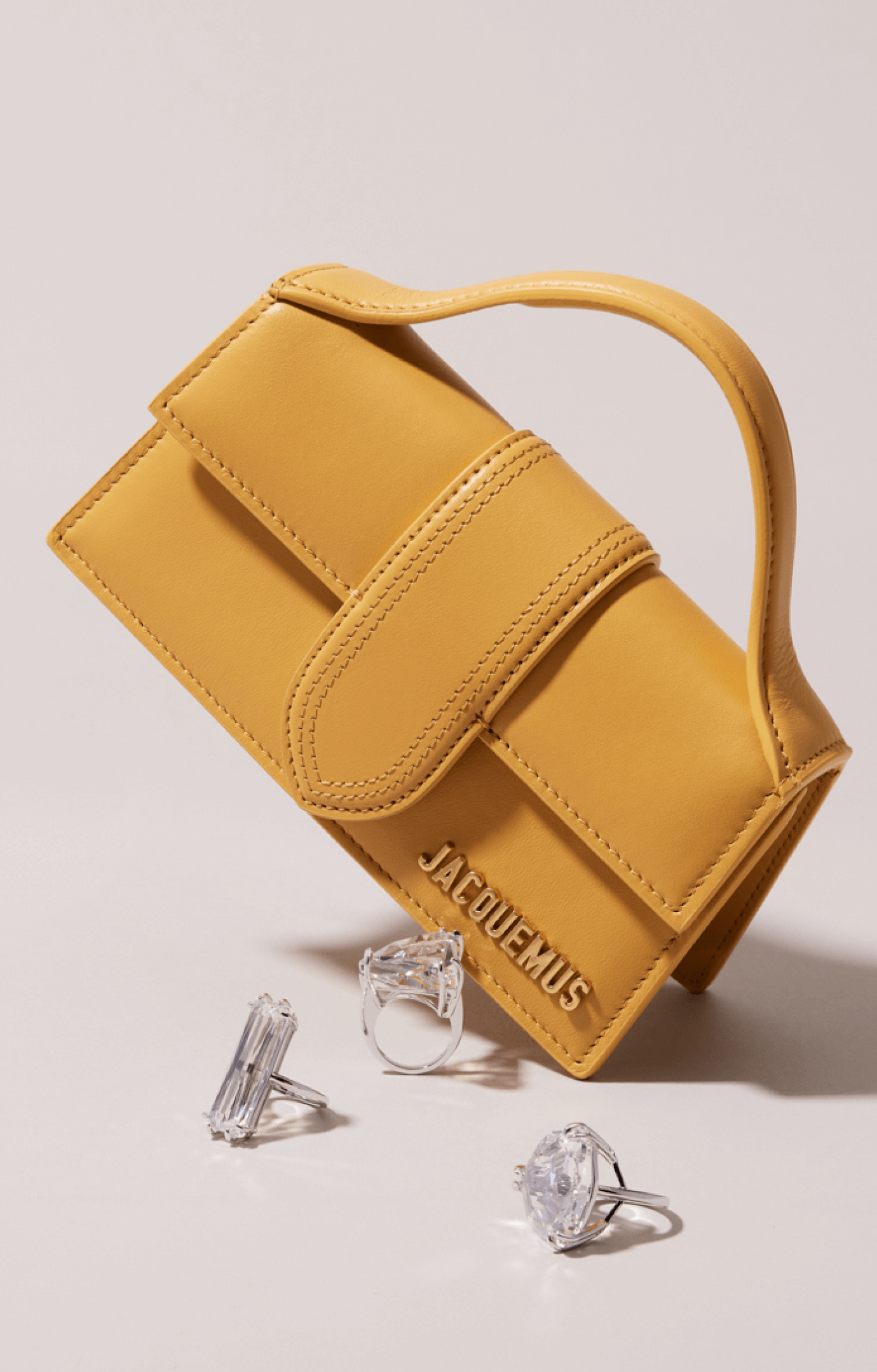
Luxury Design
Luxury design main elements:
- The diagonal line is thinner
- The green colour (does this have an official name?) is only used for Luxury communication
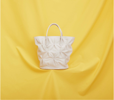
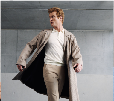
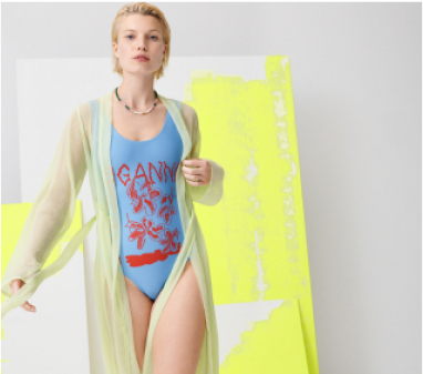
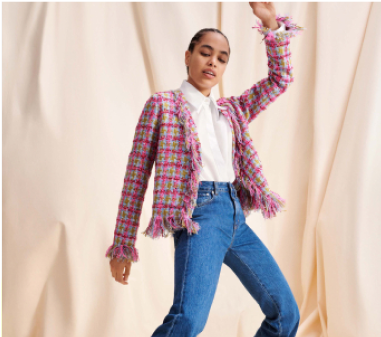
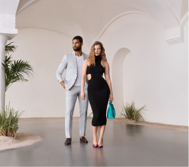
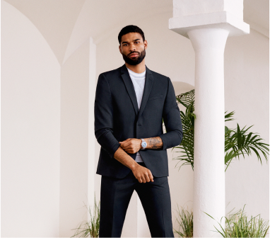
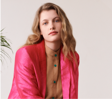
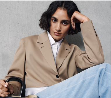
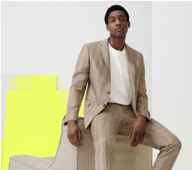
- Images are exclusive and high quality without busy backgrounds
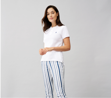
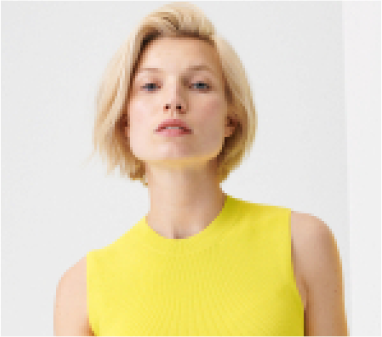
- Models should have a timeless and premium look
- The subheading is kerned
- More elevated language and vocabulary
CRM / Main Layouts
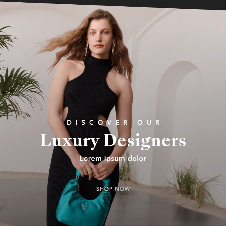
The luxury design is built through the use of space and subtle details, blending typography with elevated images for a "special" look and feel.
Main layout: Our typography consists of headlines in SansBleu Kingdom and subtitles in Avenir LT PRO, all caps and with added kerning (see next page)
Background: The highlight colour will never be used for backgrounds, just specific details.
Colours: Maintain a good contrast between the background/photo and text, making readability a priority. Gradients can be used in black or white to help with contrast.
Highlight colour: Only used for details (we repeat this above in background section)
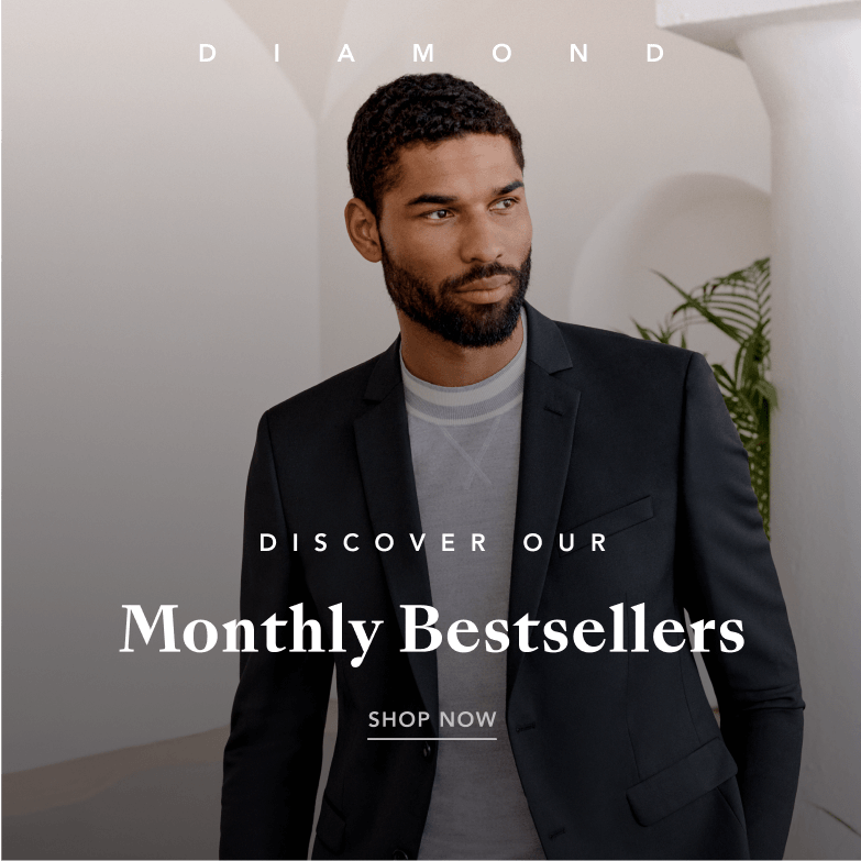
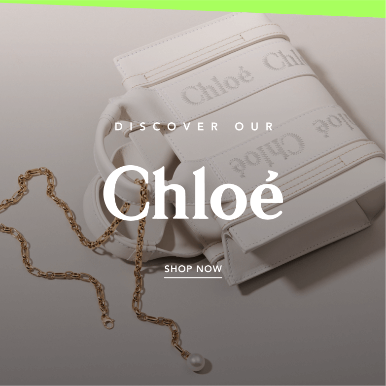
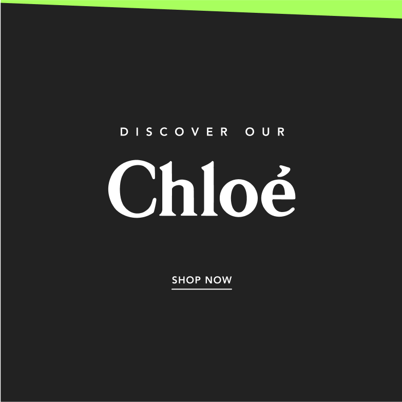
SH + Body text:
- Avenir LT Pro.
- Styles: Heavy and Medium
Headline:
- Sangbleu Kingdom
- Styles: Bold
We use SansBleu Kingdom for headlines and titles, and Avenir LT Pro for subtitles and body text.
To create a more elegant and spacious look, we use Avenir LT Pro in Regular and Medium. (this is different than what is indicated above as Heavy and Medium) We add extra kerning to highlight the category name and in some subtitles for a cleaner aesthetic.
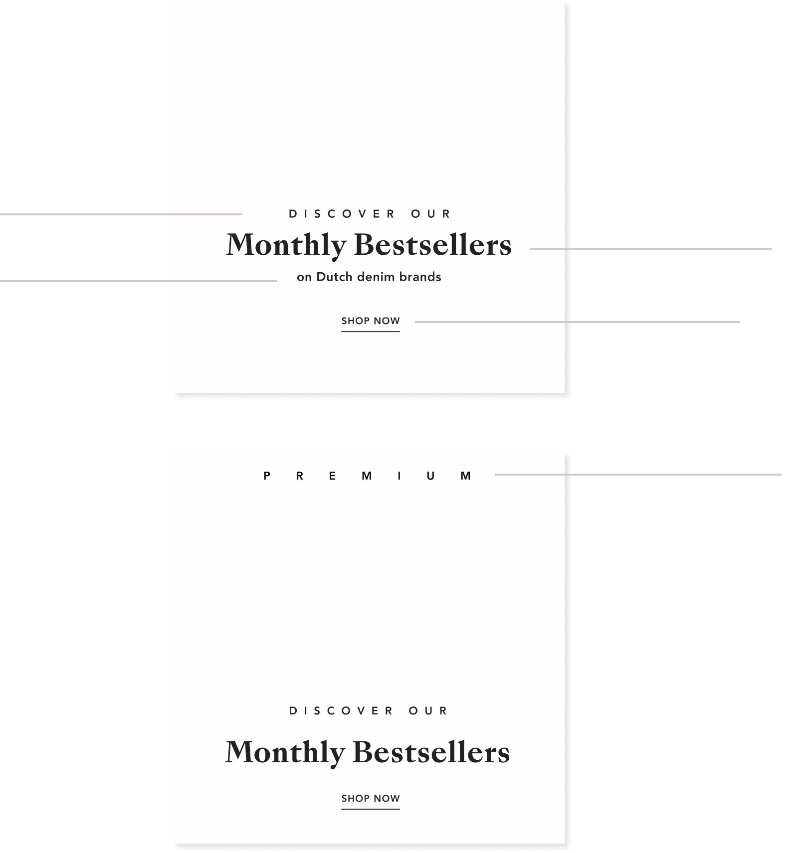
CRM and SOME Elements
The luxury design is built through the use of space and subtle details, blending typography with elevated images for a "special" look and feel.
Main layout: Our typography consists of headlines in SansBleu Kingdom and subtitles in Avenir LT PRO, all caps and with added kerning (see next page)
Background: The highlight colour will never be used for backgrounds, just specific details.
Colours: Maintain a good contrast between the background/photo and text, making readability a priority. Gradients can be used in black or white to help with contrast.
Highlight colour: Only used for details (we repeat this above in background section)
Diagonal:
Thinner and more subtle, only used in black and the highlight colour.
Contrast:
Maintains a strong contrast between typography (black or white) and the photo/background.
Colour:
Black background or an image with details in highlight colour (diagonal or Dach, line or CTA).
Do not use the highlight colour for text.
CTA:
Always underlined. Used in white or black. The highlight colour should only be used for special occasions.
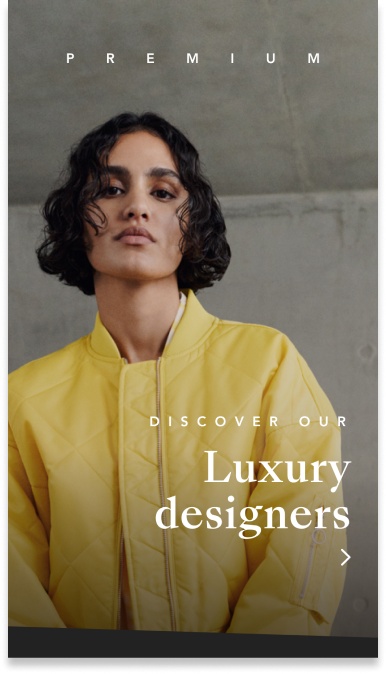
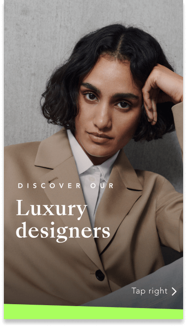
Name category + HL + SHL + CTA
(SansBleu + Avenir LT PRO)
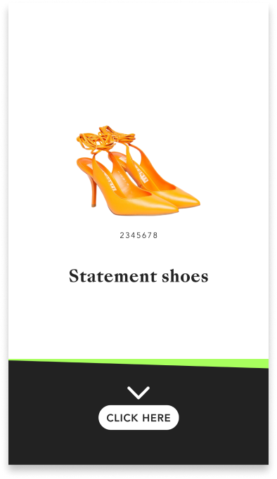
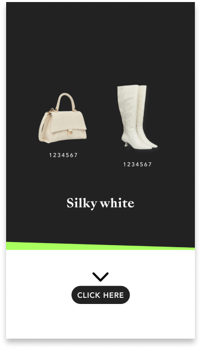
HL + Code number + CTA
(SansBleu + Avenir LT PRO)
Presentation
Tone of voice: Images and different visual elements in the layout offer elegance and exclusivity.
Contrast: It's important to keep a strong contrast between the background/image and text for easy readability.
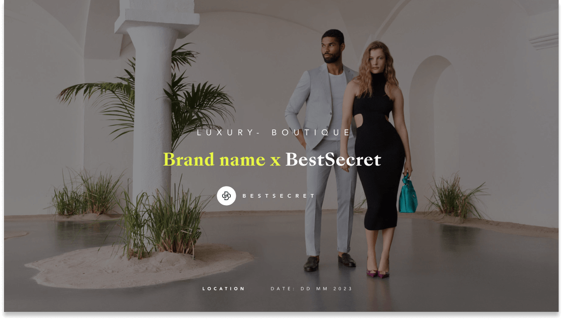
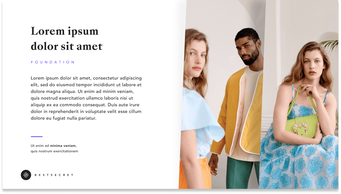
Dash line: Used in black, white, or the highlight colour to help separate different hierarchies of information.
Text: Title (SansBleu) + Subtitle (Avenir LT Pro Medium + kerning) + Body (Avenir LT Pro Medium)
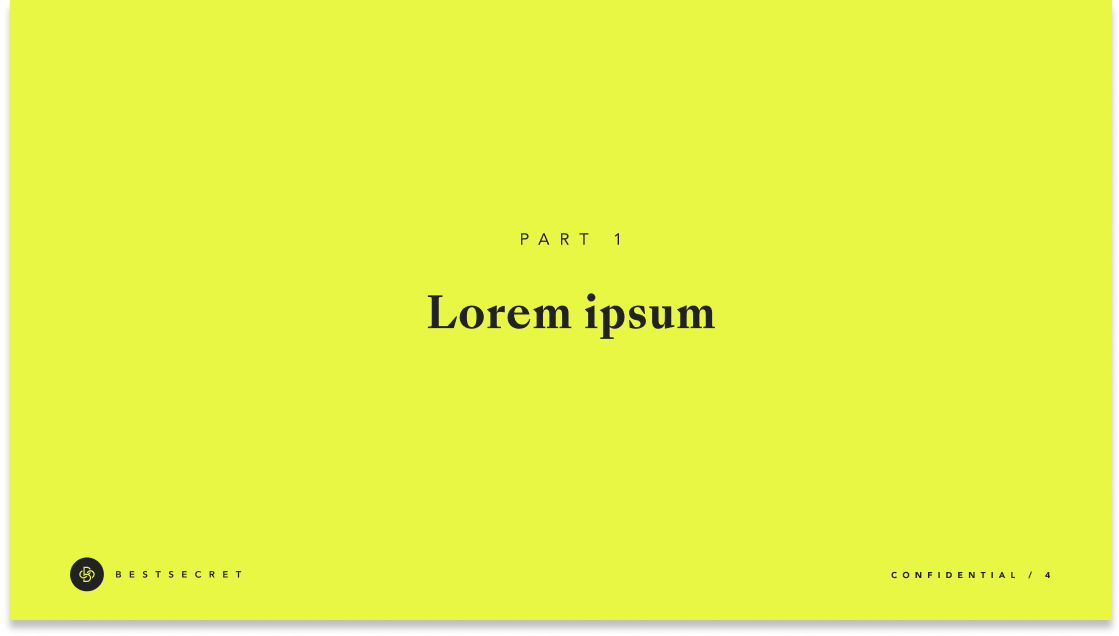
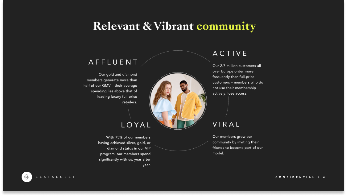
Art Direction & Imagery
Luxury Design
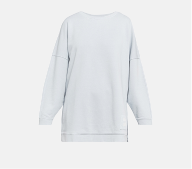
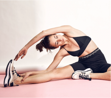
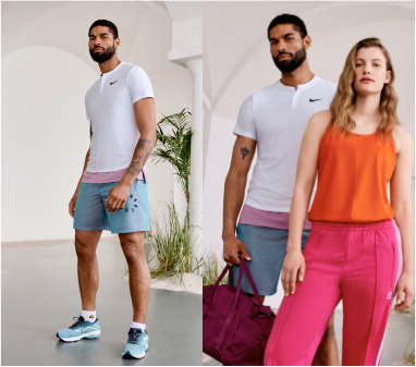
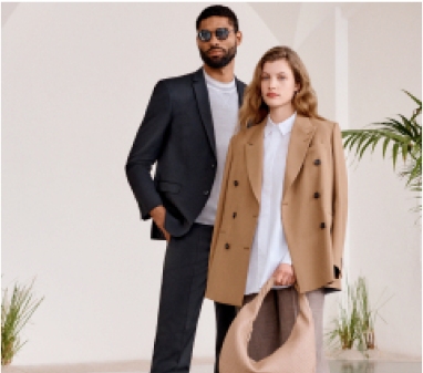
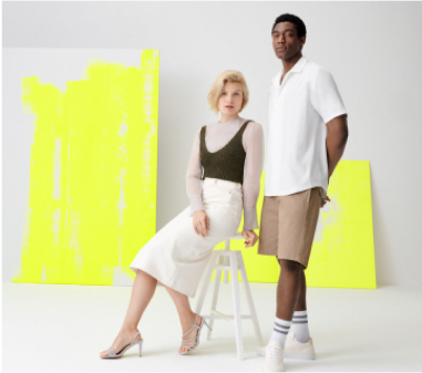
One full background image. The models should have a sleek, premium, elevated, timeless looks and strong poses. Ideally avoiding, sports, informal or loungewear. Neutral Background colours. Always use a premium curated selection of our latest material.

Regular Communication
Normally, we use different resources in layout and image selection. Generally we use images that reflect a theme or seasonal topic. We use images from our extensive image library, from all seasons, from different shootings, therefore, they have different look and feel, different background styles, different colour correction. We also use highlighted products from our shop and stock images.