
CRM
Inspirational Campaigns
Main Layouts
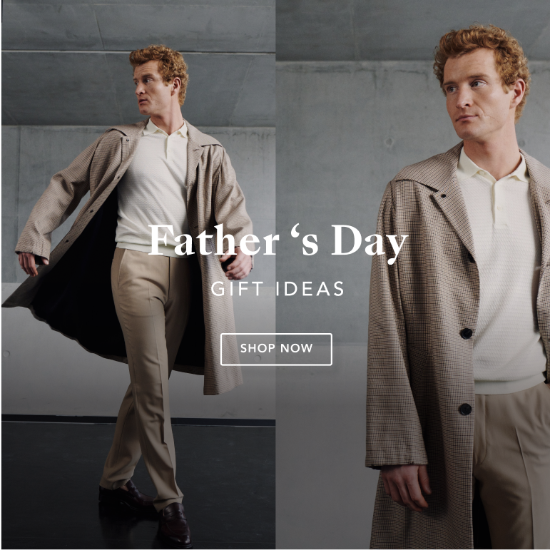
For this type of communication, considering that we generally do not have much information to display, we suggest a clean and attractive art-board.
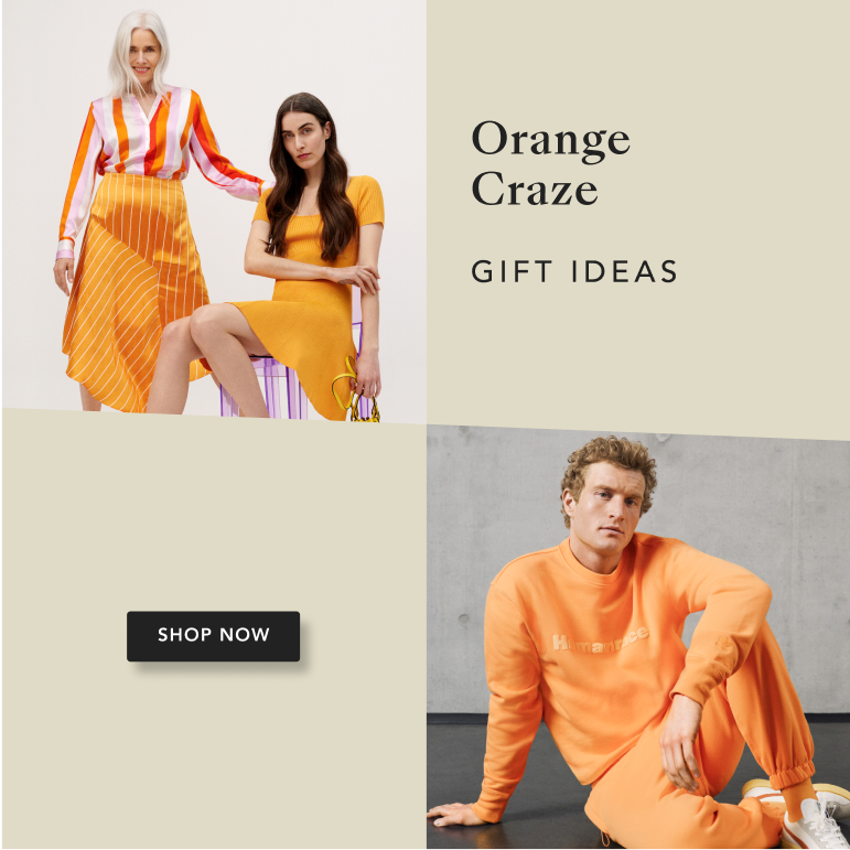
We propose four layouts that will help us standardise our communications and respond to different communicational needs. We have developed a system of elements that can work together in these different layouts.
We have added a new element into our layouts layout, the diagonal shape.
- The bottom diagonal stripe will help us highlight important occasions. Here, we can incorporate ad hoc colours.
- The 4x grid with diagonal is only used for the horizontal sides.


Important
- In case we need to add icons or some kind of illustration, they should be aligned to our guidelines/ BS UI icons, outline icons.
- Ad hoc colours will be implemented ONLY when the communication is directly connected to a colour. For example, Kings Day or French Days may require a specific colour. The use of ad hoc colours will be at the discretion of the design team.
Main Elements
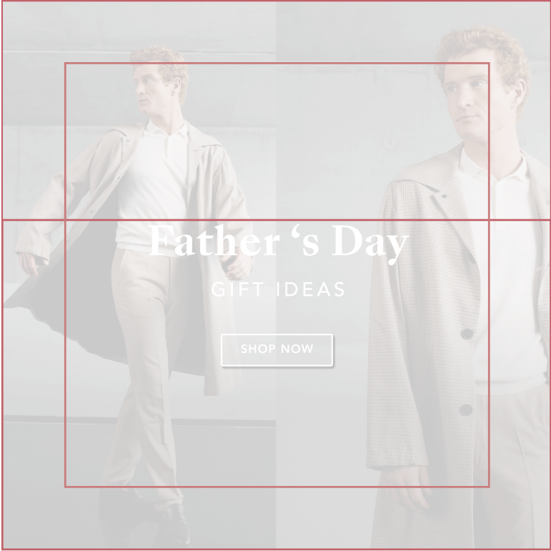
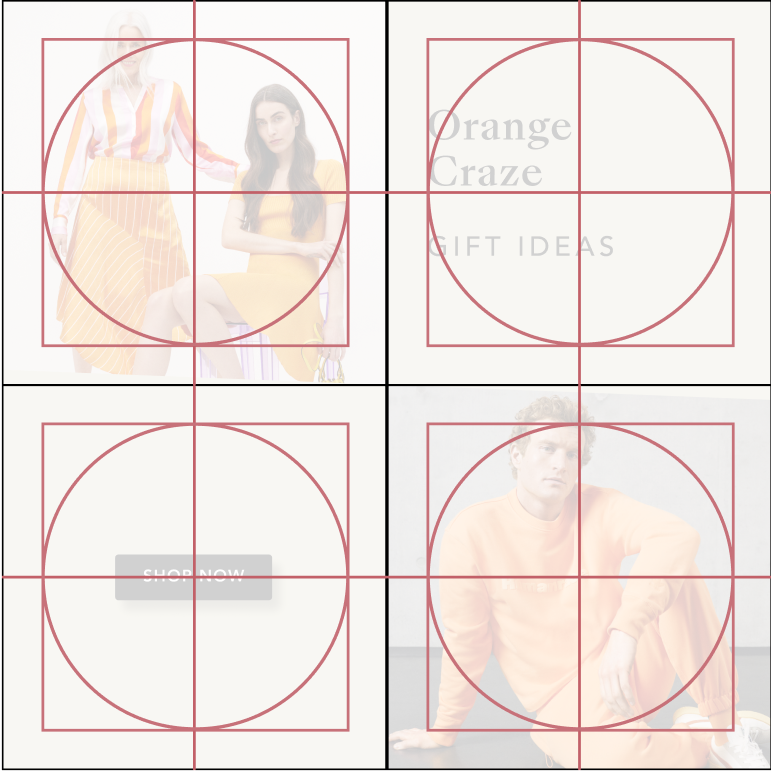
We have created different grids for different layouts, which will help the designer to correctly place every element in the visuals. All the text styles are also defined and aligned with the components built on top.
- The grid defines the padding and height of the main elements.
- Each text has its own text style defined, and we have also created a text layout component that can be easily dragged and dropped.
- The CTA location component contains all possible locations for the CTA to be placed.
- The big red square defines the padding of the text, and the red horizontal line defines the height.
- We have defined three different heights to use.
- The 4x grid has its own grid, and the text can be aligned to the left, centered, or stand in the center.
- The CTA must always be centered when it is alone.
- We have defined specific grids in case we need to integrate logos.


Brands Campaign
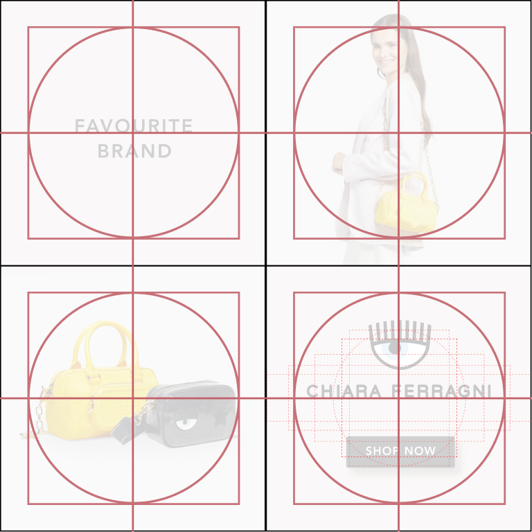
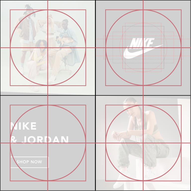
We have also defined 4 different Layouts when integrating a logo.
- Divided Layout with Sub-headline and Logo in the Center
- Full-image with Logo in the Bottom and CTA
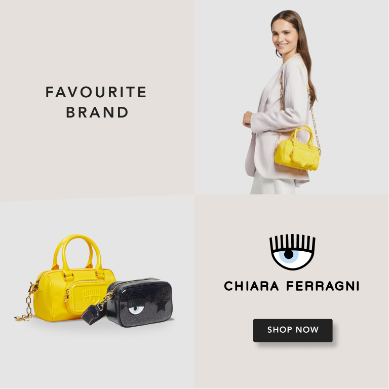
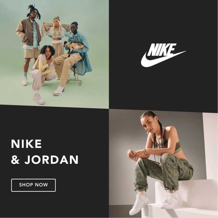
- 4x grid with Headline, Logo and CTA
- 4x grid with Headline, Logo and CTA 2
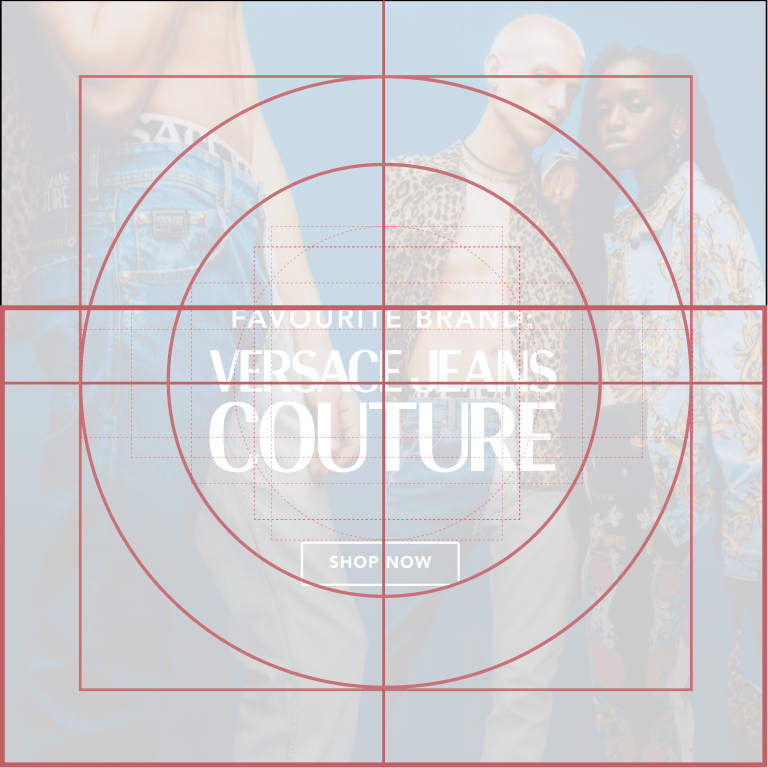
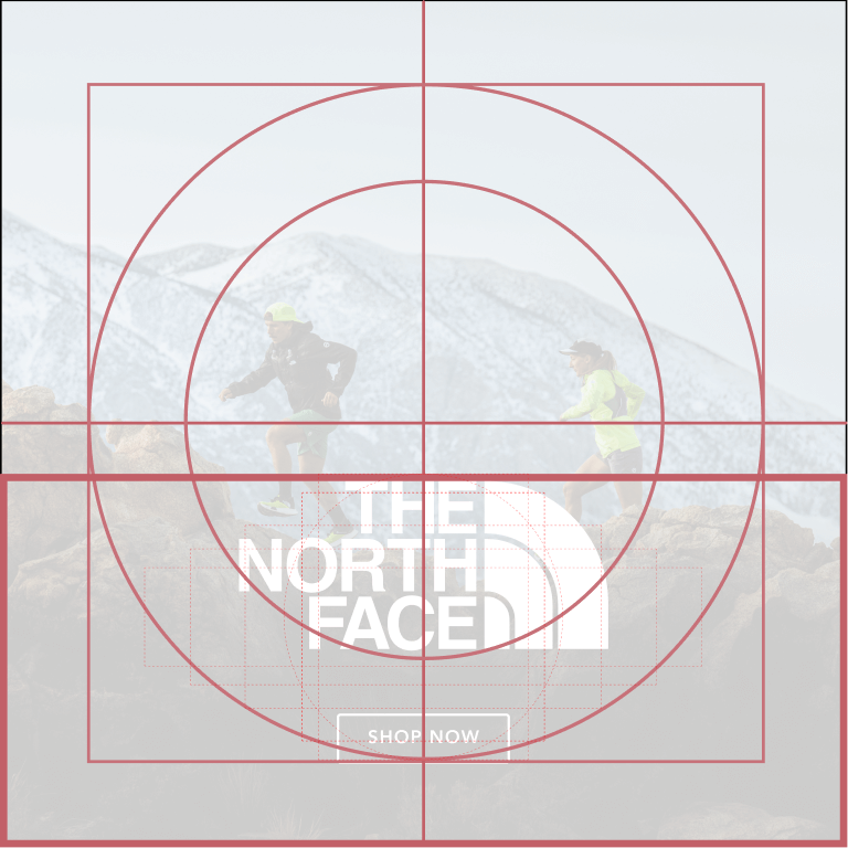
For the first two layouts, we have defined two heights that can be used. In both cases, it is possible to add text or titles, always respecting the relationship and balance shown in these examples. The logo should be the most important element.
For the 4x grid, we suggest two different options where we have already standardised the position of the logo, the text style, and CTA.
Font: We will use Avenir LT Pro for all the text that acompany our Brand’s visual as to make it cleaner for the Brand to shine


Grids
The different grids will define where and how to place the different elements. In this case, we must always pay special attention to the logo and how to highlight it.
Blockbuster Campaigns
Main Visuals
The Blockbuster Campaigns will have their own grid to give more space to the information and the photo. Several elements will give a Blockbuster campaign its own personality and highlight it from the rest:
- We will always use the dedicated BB colour palette.
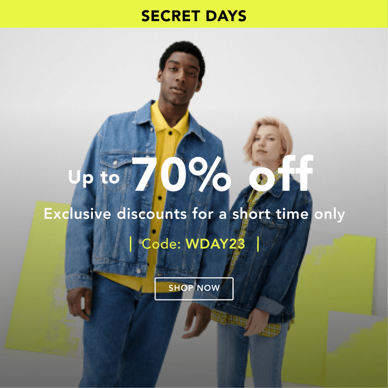
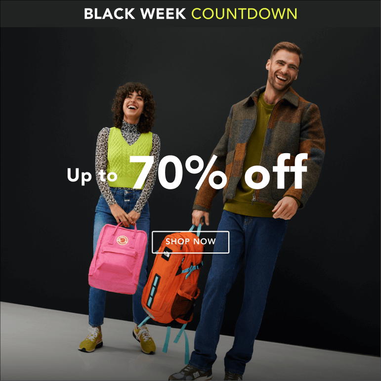
- The stripe on the top will contain the Campaign Names + Extra/VIP text. It will be straight without diagonal (1) to give space for all the information we need to communicate, (2) to give space to the full photo behind, and (3) to differentiate it from other campaigns. Although we need to include a lot of information in this type of communication, we must always take special care to make it look clean and top-level.
- Full-image: Considering we have a special shooting for these campaigns, we will always use one full photo for the background image.
- PN and banners will use one full colour as a background in order to optimise the readability of the texts and provide a cleaner, modern and premium look.
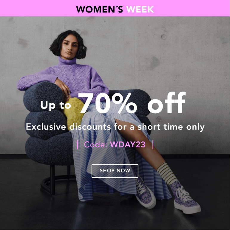
Grid and Padding
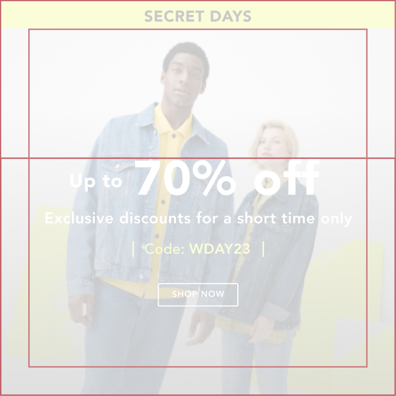
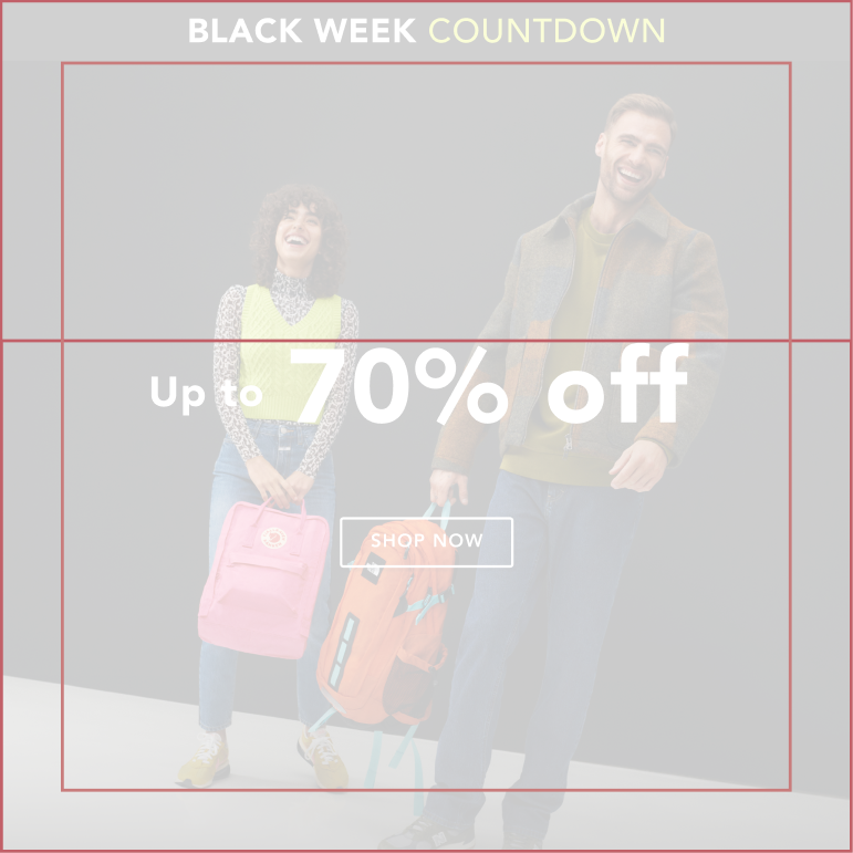
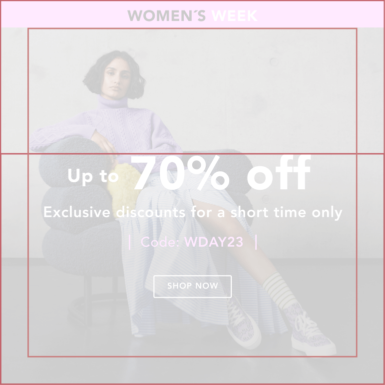
The grid will define the place of each element and text. Every element will be centered in the art-board.
The visual is built by its main elements:
- Stripe + Campaign Name
- Discount + Body text + code (it is not mandatory to have all these elements)
- CTA (we must always have the CTA and take great care of the contrast with the photo)
- Full image and gradient (black + multiply gradient will help us optimise the contrast between the text + image)
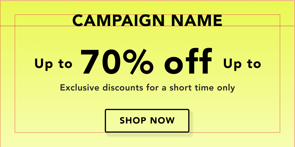
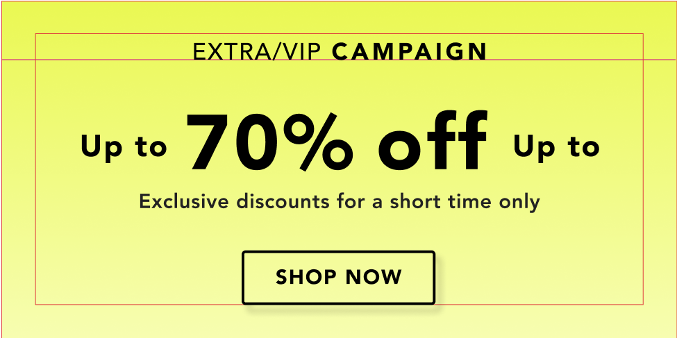
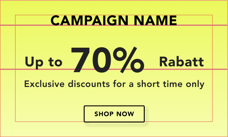
Banner and pn
The grid will define the place of each element and text. Every element will be centered in the art-board.
The visual is built by its main elements:
- Campaign name or Extra/Vip/Last Chance + Campaign name
- Discount + Body text and/or code (it is not mandatory to have both elements)
- CTA (we must always have the CTA and take great care of the contrast with the photo)
- PN and banners will use one full colour as a background in order to optimise the readability of the texts and provide a cleaner, modern and premium look.


Sale
Main Visuals
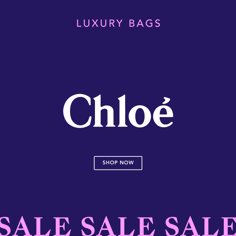
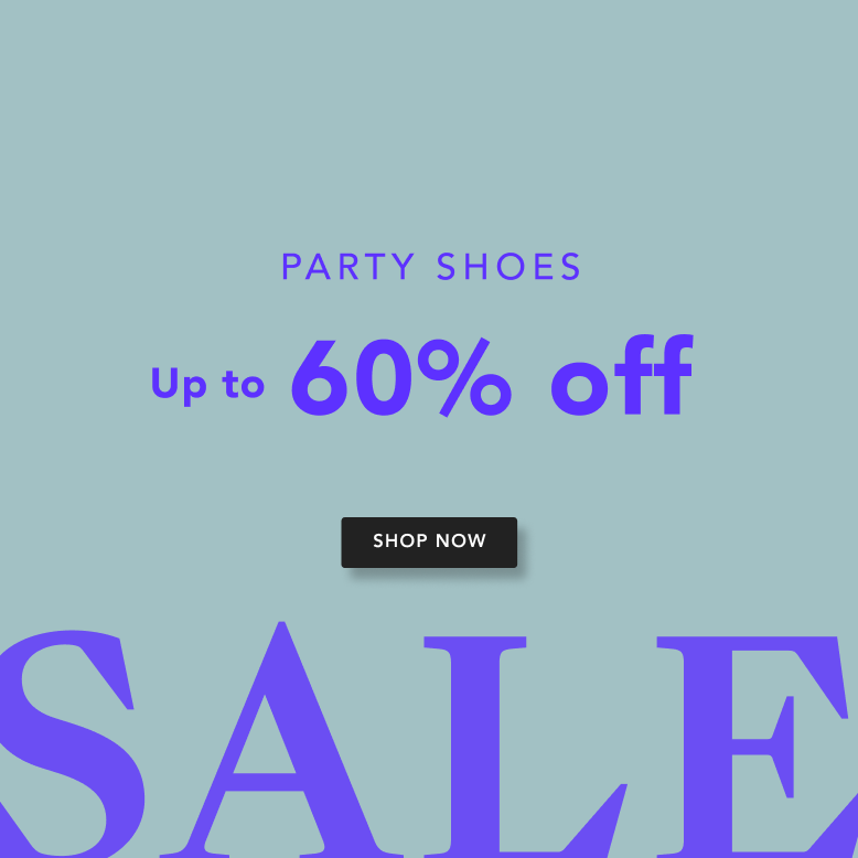
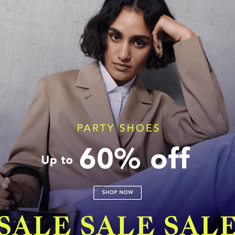
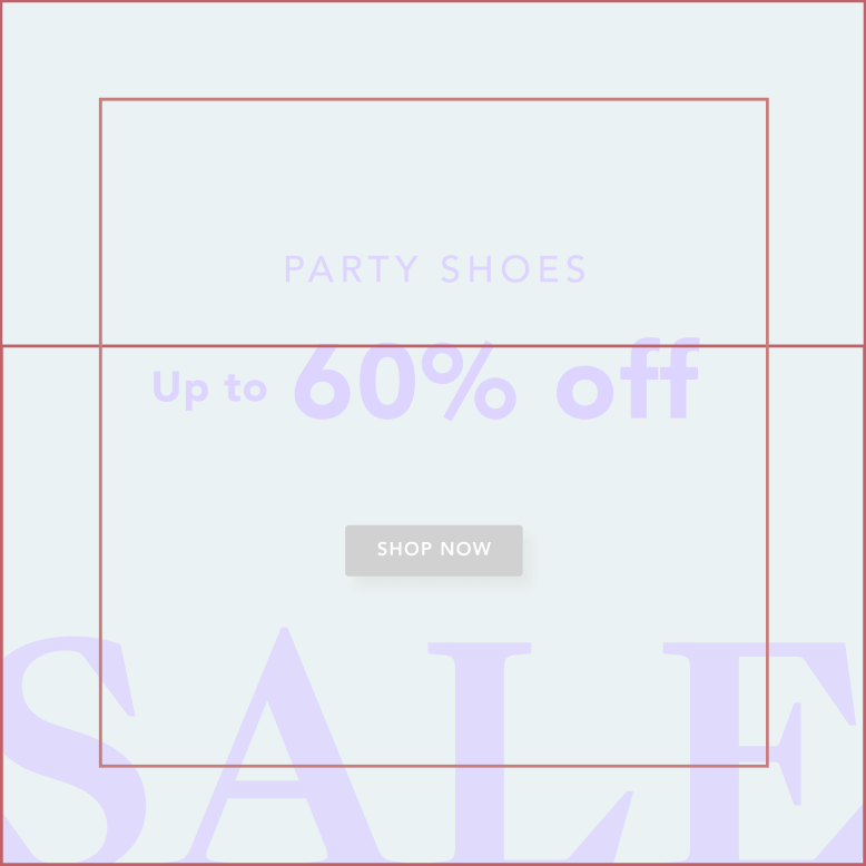
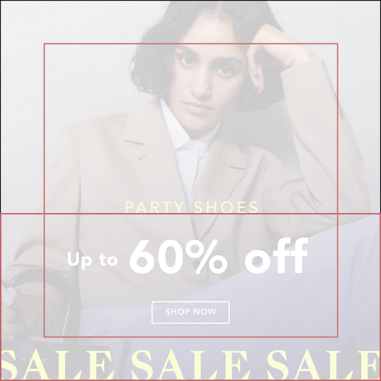
The SALE visual will use the grid already used for INSPIRATIONAL.Several elements will give the Sales campaign its own personality and highlight it from the rest:
- We have 2 main layouts for Sales,
a. 3x Sale wording in line on the bottom
b. With the big Sale wording at the the bottom - For full-image visuals, we can use either a gradient or a solid colour background, but we must ensure that the product's original colour is not distorted, and that the logos are used correctly. More importantly, we must maintain a proper contrast between the logo and text.
- For gradient backgrounds, we have already created different combinations that are approved for use as components. The direction of the gradient should not be changed, and neither should the colours be altered. If it is necessary to make adjustments for better contrast, only minor changes should be made while maintaining the correct proportions.

Grids
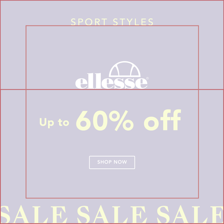
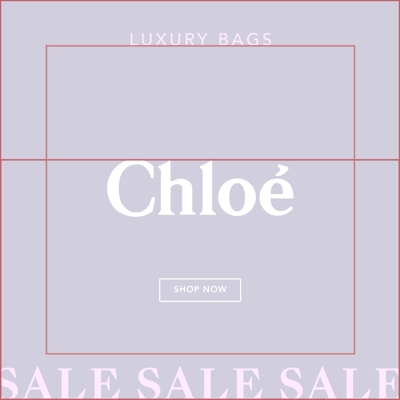
The grids used for Sales are the same as those used for INSPIRATIONAL and NEW IN, with the objective of achieving more consistency and clarity.
The padding cannot be modified. The horizontal line suggests different heights, but it is possible to adjust the height of the text and elements to achieve better use of the photo and legibility of the text.
New In
banners
PN and banners will use one full colour as a background to optimise the readability of the text and provide a cleaner, modern, and premium look.
The different components are available to use in the library and will help maintain the right height and design system.
- Background: Full colour with the Sale wording in a different colour (according to the colour palette).
- Campaign name + Discount: Always centered. You could turn on or off different components, always taking care that the elements are centered.
- CTA: Always on the right side.
Secondary options
Code: It is not common, but if it is necessary to use a code, you can activate the Code component to use.




Push Notifications 1000 x 500
Push notifications will use one full color as a background to optimize the readability of the text and provide a cleaner, modern, and premium look.
The different components are available to use in the library and will help maintain the right height and design system.
There are two different layouts (primary and secondary). Use the secondary option only if we have more text and cannot use the primary.
- 4x Sale wording: Full-colour with Sale in-line at the bottom, available in different colours (according to the colour palette), already available in the component library.
- Sale on top: If more space is needed (for code/text), we could use the secondary option.
Campaign name + Discount: Always centered. You could turn on or off different components, always taking care that the elements are centered.
CTA: Always at the bottom.
Code: If needed, you can activate the Code component to use.

Campaign name+ Discount+ CTA
Sales in line on the bottom


Sale+ Discount+ code/text + CTA
Push Notifications 750 X 500

Campaign name+ Discount+ CTA
Sales in line on the bottom
Sale+ Discount+ code/text + CTA
Main Visuals
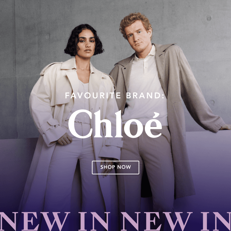
The NEW IN visual will use the grid already use for INSPIRATIONAL AND SALE. Several elements will give the NEW IN campaign its own personality and highlight it from the rest:
- Colours: Seasonal colour palette with different combinations for Spring-Summer and Autumn-Winter.
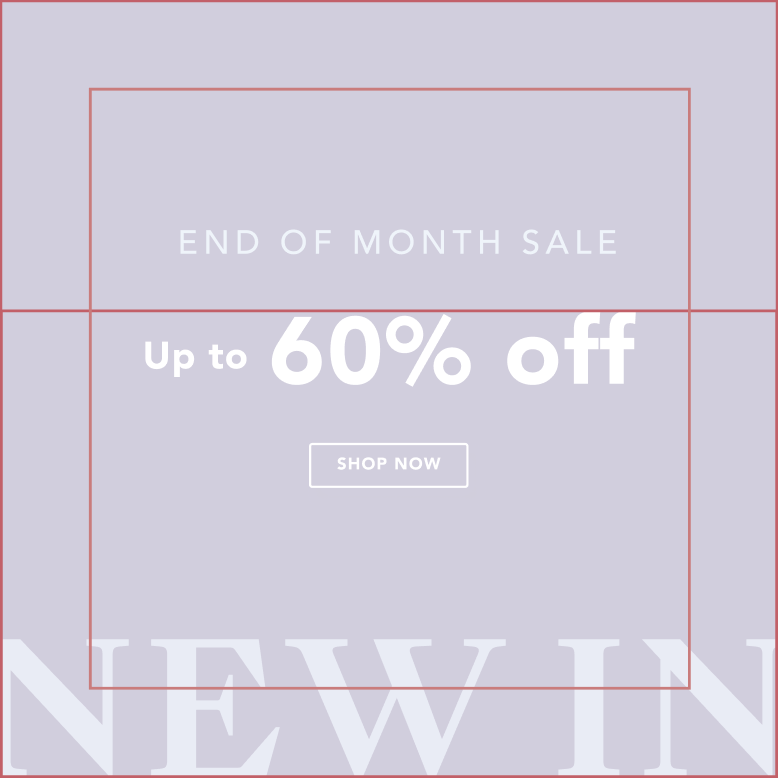
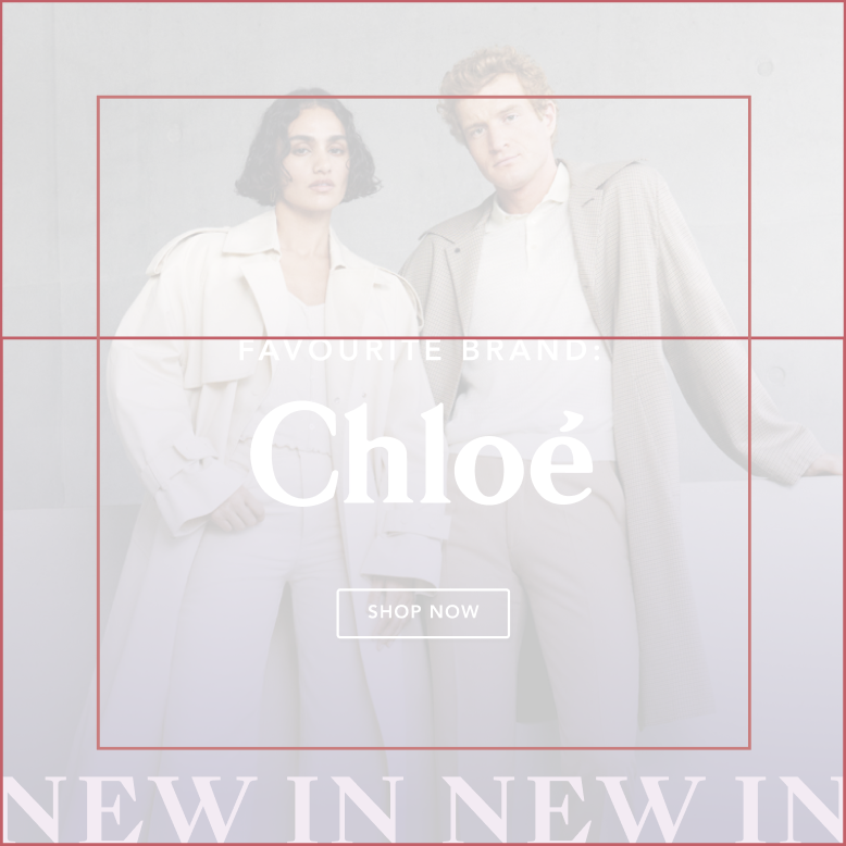
- We have 2 main layouts for NEW IN:
a. 2x NEW IN in-line at the bottom
b. With the NEW IN wording in size L at the bottom - For full-image visuals, we can use either a gradient or a solid colour background, but we must ensure that the product's original colour is not distorted, and that the logos are used correctly. More importantly, we must maintain a proper contrast between the logo and text.
- For gradient backgrounds, we have already created different combinations that are approved for use as components. The direction of the gradient should not be changed, and neither should the colours be altered. If it is necessary to make adjustments for better contrast, only minor changes should be made while maintaining the correct proportions.


(Full color BG +Big New in)
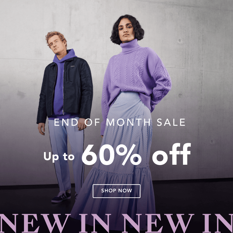
(Full img + 1 line new in + Gradient)
(Full img + 1 line new in + Gradient)
Grids
The grids used for NEW IN are the same as those used for INSPIRATIONAL and SALE, with the objective of achieving more consistency and clarity.
The padding cannot be modified. The horizontal line suggests different heights, but it is possible to adjust the height of the text and elements to achieve better use of the photo and legibility of the text.


Banners and push notifications
PN and banners will use one full colour as a background to optimise the readability of the text and provide a cleaner, modern, and premium look.
The different components are available to use in the library and will help maintain the right height and design system.
- Background: Full colour with the NEW IN wording in a different colour (according to the colour palette).
- Campaign name + Discount: Always centered. You could turn on or off different components, always taking care that the elements are centered.
- CTA: Always on the right side.
Secondary options
Code: It is not common, but if it is necessary to use a code, you can activate the Code component to use.




Campaign name + Discount+ CTA

Discount+ code+ CTA
Push notifications will use one full color as a background to optimize the readability of the text and provide a cleaner, modern, and premium look.
The different components are available to use in the library and will help maintain the right height and design system.
There are two different layouts (primary and secondary). Use the secondary option only if we have more text and cannot use the primary.
- 3x NEW IN wording: Full-colour with NEW IN in-line at the bottom, available in different colours (according to the colour palette), already available in the component library.
- NEW IN on top: If more space is needed (for code/text), we could use the secondary option.
Campaign name + Discount: Always centered. You could turn on or off different components, always taking care that the elements are centered.
CTA: Always at the bottom.
Code: If needed, you can activate the Code component to use.



Campaign name+ Discount+ CTA
Sales in line on the bottom

Sale+ Discount+ code/text + CTA